
In the dream, I speak.
“What about the whales?” Immediately, hulking skeletons poke from the black walls around me, filling the space with a lunar glow. The jointed carpels, metacarpals and phalanges of a flipper float up, meet my own hand. I see the stretch and squeeze of the same bones in a line of hands now opening their boxes on the wall beside me, connecting my palm and the whale’s in a row of evolutionary precursors. There is no text anywhere, of course.
“What does the world look like to a slug?” The room files away its cetaceans and now the drawer of what looks like a tiny filing cabinet shoots past my nose. On it oozes a procession of slimy gastropods. I am handed two orbs and I hold them against my face to see what the slugs see: unfocused movement, fear of shadows. The ability to pull my eyes inside my face.
************
This was a real dream I had, once. And despite my general inability to remember any dream by the time I start breakfast, this one has always stuck with me. Why? Because this simple, dark room in my dream, where objects and interpretation are revealed precisely and intimately, has become to me the pinnacle of what a natural history museum can be. And, though I can’t say I dream about museum theory very often, I can say that this vision has informed my focus for how to improve visitor engagement in the museum where I work.
So what do I mean by this?
Well, let’s start with what today’s science and natural history museum looks like in real life. Most feature an impressive taxidermy animal or dinosaur at their entrance. You walk past it, down the exhibit halls where you will no doubt see tanks of live animals– often bugs, and almost always a sampler of the native snakes in your region. Beneath you and beside you are beautiful graphics describing the animals, their habits and the niches they fill in their environment. Now, a bit further along you hear a scientist’s voice being piped out of a speaker playing three minutes of repeating tape about the diversity of Cambrian invertebrates. And now you realize your foot is taking up the whole era on the line of earth-time stretching across the museum floor, from Hadean to Holocene. You look around you and see all manner of elaborate graphics and textures gripping even the smallest spots of bare wall. There are buttons to press, video screens to watch, furs to feel and everywhere there’s science to learn.
If you’re like a lot of people, this is the stage where your eyes glaze over. You realize you can’t possibly read every sign or try every option on the touchscreens. So you wander, you look, and you skim. I think this is a problem.
I had a teacher once named Mr. Ghent who covered his entire classroom in posters about earth science. As he explained it, this was to engage his pupils in “immersive learning” where even if a student got distracted and wasn’t watching the blackboard, he would be forced to learn elsewhere when his eyes had nowhere to go that wasn’t a pithy breakdown of the earth’s core, mantle and crust. I think modern museums, particularly natural history museums, are attempting a similar strategy.
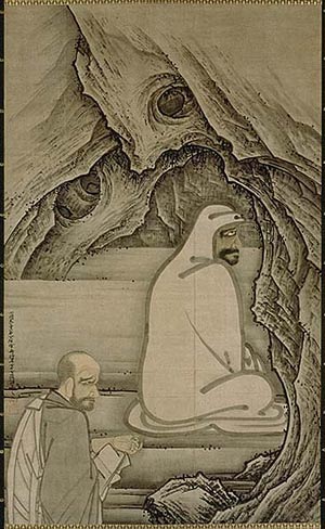
But there’s a lot to be said for the blank wall. Just ask 5th Century Buddhist Monk Bodhidharma, who supposedly stared at the side of a cave for nine years straight. A blank wall is helpful because it is underwhelming. Because it gives space to the viewer for focus.
So what point am I trying to make? That museums should fire their graphics team and exhibit designers and hire an all-star band of painters, armed with a barrel of pitch?
No. I’m saying museums shouldn’t fill every corner of their premises with overwrought and, at the same time often insufficiently specific, stuff. Instead, they should allow space for intimacy and connection by not filling in all the gaps.
I’ll give you an example. The museum where I work, the North Carolina Museum of Natural Sciences, essentially doubled in size a few years back when it added the “Nature Research Center,” a fresh wing of the museum dedicated to exploring how scientists know what they know. It’s a remarkable space. Within it are housed three full research labs, complete with P.I.s and graduate students, that do their work in a glass “fishbowl,” where museum guests can watch scientists at work. It’s a really neat idea.
But what I don’t find effective about the space is how the exhibitry unfolds.
For one thing, it’s limited in a sensory… sense. The halls are full of pictures and paragraphs but, aside from a bronze statue of a lab rat adorably labeled “man’s best friend,” there’s not much to touch. The meteorites are all behind glass, the giant diatoms float just out of reach behind a railing, and the mammoth skull dangles eight feet above your head.
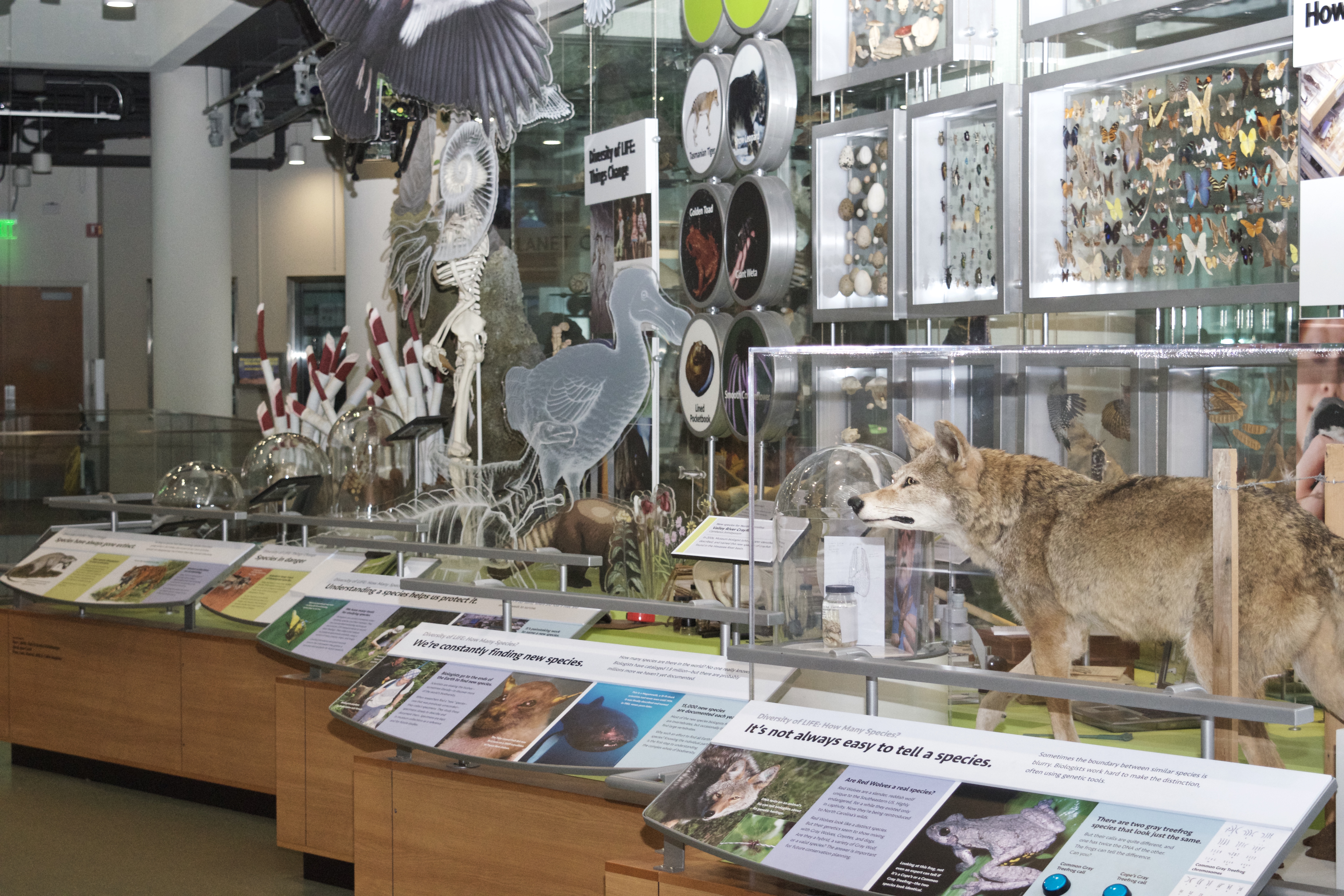
But my main issue is the packaging. There’s too much stuff. There are too many labels, too many pictures, too many graphics and dioramas squished together—artfully but in a predigested, sterile sort of way. And I’ve seen this same thing in many different museums, including museums not focused on natural history. It’s a trend.
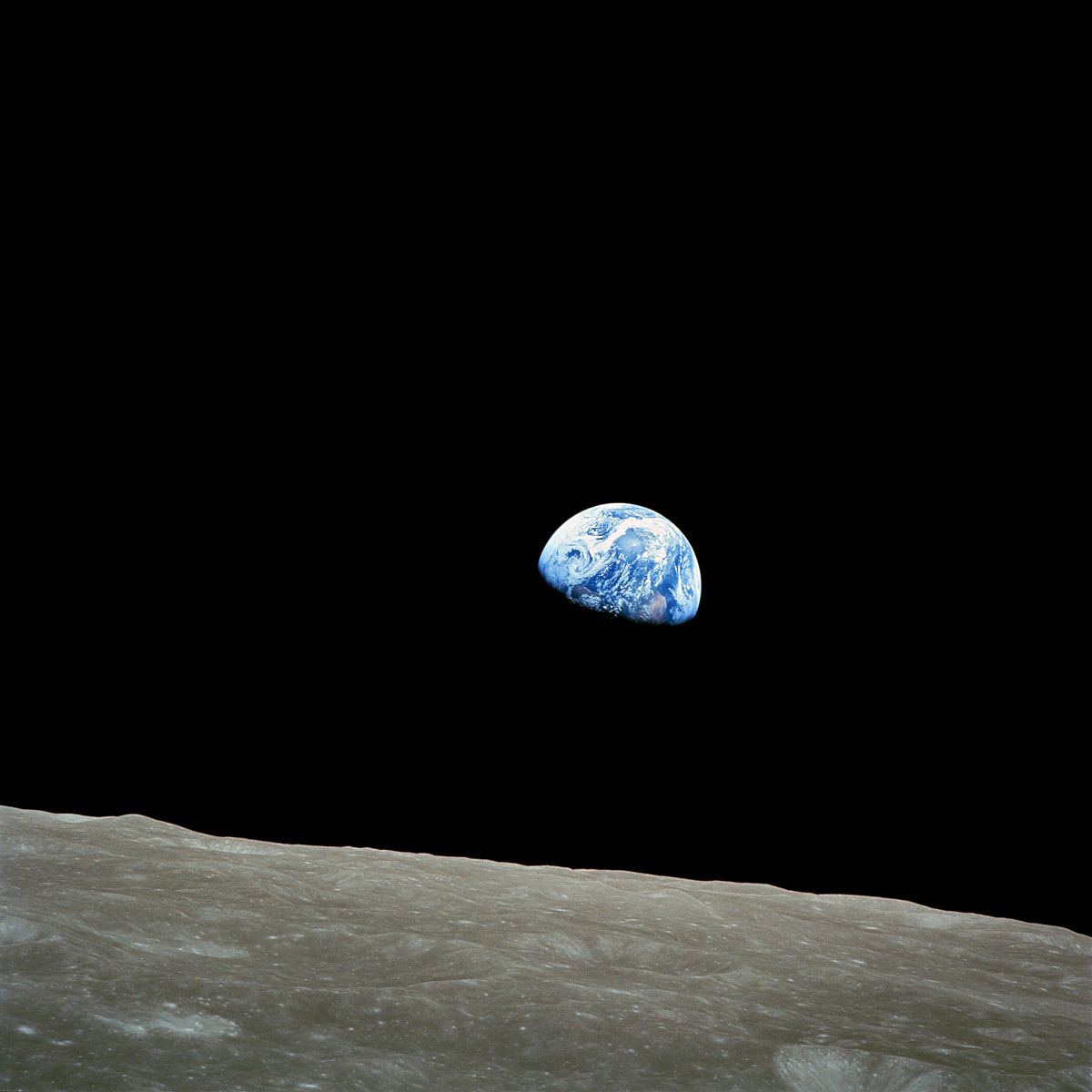
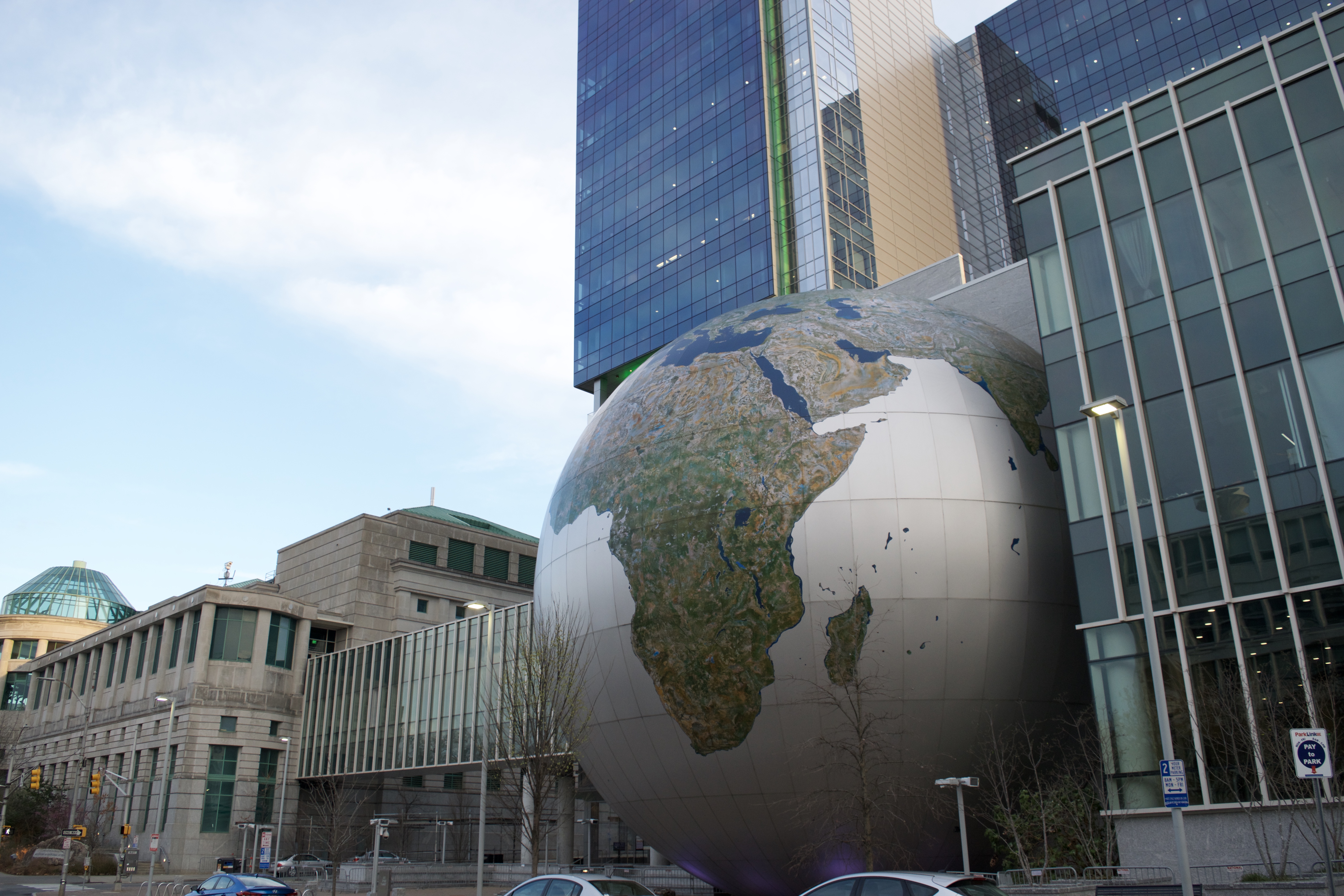
Perhaps my point will be made clearer if I point out what is effective. What is effective is our 40-foot tall spherical beacon of a landmark, the Daily Planet. This giant globe sits in front of the Museum, drawing visitors in better than any special event or expensive advertising campaign ever could. Why? Because it’s simple. It’s impressive. And it gives space for daydreaming. Like the Earthrise image of a terra-crescent rising above the lunar surface taken by Apollo astronauts– considered by some to be the most influential photograph ever taken– the Daily Planet shows that you can communicate a lot of importance with something simple.
“But what about the science?” you ask. “How can a natural history museum do what it’s supposed to do and communicate science and nature without any sort of explanation of a museum’s exhibitry?”
I agree. You have to couple the introspective with something expository. But that role shouldn’t be relegated to text and graphic every time.
For one, there should be a bigger role for real live humans on museum floors. I remember a few months ago I walked into the North Carolina Museum of History for the first time in a few months. I wandered the halls, looked briefly at a Civil War uniform, and watched part of a video about the changing face of Raleigh. But before I left I was greeted by a floor interpreter armed quite literally with an atlatl and a rabbit fur. We ended up talking for twenty minutes, and I learned (and retained) more information about Native American hunting techniques than I could have bothered to pick up in twenty trips to the Cherokee exhibit behind her.
So there’s that. Museums should be investing a lot more in floor programming than they are currently (my museum, for example, which hosts one million visitors per year, employs one part-time employee to run floor carts). But another technique for deeply engaging the public in your museum is allowing for self-discovery. Museums are so concerned with immediately feeding factoids into their visitors that they lose sight of the awe and wonder in the artistry of their subject. For example, I think it’s pretty ironic that the new wing of our museum, with its laser focus on the scientific process, allows little room for visitors to connect their own dots, as all scientists must do every day.
Our Daily Planet would inspire a very different sense if every country, capitol and ocean were labeled, and twenty four clocks clicked the different time zones in a belt around the equator. The Daily Planet is effective because it’s not overwrought. Earthrise inspired conservation, not because an environmentalist broke down the points on the photo where you can see the earth’s receding ice caps. It inspired conservation because everyone that looked at it was immediately touched with the sobering awe and dread that comes when you realize every person that you care about lives in a blue-green speck suspended limply on a titanic black canvas. And that’s something people have to find out on their own.
In summary, I think museums could learn a lot from the less is more philosophy when it comes to exhibit design. I want to see museums with a simple focus on a groundbreaking narrative that allows space for visitors to explore the nooks and crannies of that narrative by the enterprise of their own curiosity. I think a fantastic project would be for a museum to try to create an impactful exhibit completely devoid of text. Is that possible? I’d love to see someone try.
In short, I want a museum that isn’t afraid to show more than it tells. A museum that inspires first, before it explains. A museum that allows space for dreams.
This blog post was submitted to the Museum Hack writing contest happening here–> https://museumhack.com/writing-contest/